PLAYER-1
Visual Identity | Website Layout | Stationary
5 minute read
Player-1 is a music download service geared towards the video game market, specifically targeted at gamers who create video content for social media. They needed a professional yet engaging brand identity to stand out in this dynamic market. Their main goal was to create a versatile visual identity and a cohesive website layout that would appeal to young, tech-savvy content creators, ensuring their brand was both striking and easily recognisable as their primary customer touchpoint.
Player-1 had a clear vision of what they needed: a brand identity that was professional but also cool and appealing to young gamers. They wanted a visual identity that could be used across various platforms without losing its charm. Additionally, they needed a website design that fully represented their brand, as it would be their main interaction point with customers. They emphasised the importance of the brand looking modern and tech-savvy to resonate with the gaming community.
Our initial discussions were all about understanding Player-1’s audience and figuring out their market position. We landed on a concept that would integrate key elements reflecting the gaming vibe.
First up was the logo. We incorporated a ‘play’ icon into the ‘a’ of ‘Player-1’, symbolising music and interactivity, which are at the heart of gaming and content creation. We opted for a clean, linear style to give it a modern, tech-savvy feel, perfectly in line with what their audience expects. To top it off, we added a colour-shifting glow effect, inspired by the RGB lighting common in gaming hardware, making the logo vibrant and dynamic.
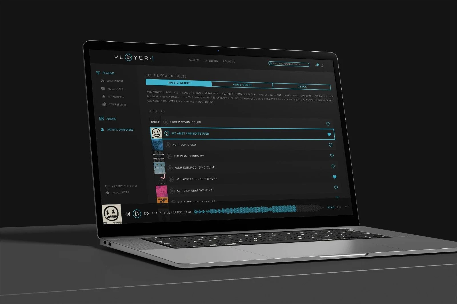
For the overall visual identity, we used an outlined style for buttons and icons to create a consistent look. We added rounded corners to various elements to maintain a sleek, modern aesthetic. The design featured dark backgrounds with bright text, mimicking gaming hardware interfaces, creating an immersive and visually striking experience.
The website design was an extension of Player-1's brand identity, ensuring everything felt consistent and cohesive. We carried the outlined style throughout the site, applying it to navigation menus, icons, and interactive elements. Rounded corners were used for buttons, containers, and other UI elements, keeping the design modern and familiar to gamers.
The colour scheme followed the same dark backgrounds with bright, colour-shifting text, making the site engaging and immersive, much like high-end gaming setups. The layout was intuitive and user-friendly, focusing on easy navigation and accessibility, so users could quickly find and download music.
While the initial brand identity and website design set a strong foundation, there's always room for growth. Future plans include adding more interactive features to the website, like customisable playlists and user profiles. We’re also looking at ways to foster community engagement through forums or discussion boards. Plus, ensuring the website is fully optimised for mobile devices will cater to users on the go.
In the end, the brand identity and website design for Player-1 hit the mark. We balanced professionalism with an appeal that resonated with young gamers. By drawing inspiration from gaming hardware and culture, we created a versatile visual identity that stands out in the competitive music download market. The result is a professional yet cool brand identity and a cohesive website design that engages and appeals to their target audience.
Player-1 now has a striking and cohesive brand identity that positions them as a top choice for gamers and content creators looking for high-quality music downloads. The design is versatile enough to evolve with the brand, ensuring it stays relevant and engaging as Player-1 grows.


